Year
2024
Client
MOMO
Category
Branding
Product Duration
3 - 4 Weeks
When MOMO approached us with a tight deadline for a logo submission, we quickly immersed ourselves in understanding their core mission and long-term vision. Despite the time constraints, we carried out a focused analysis of their target audience, competitors, and positioning in the sports-tech space. This initial research shaped not only the logo but also laid the foundation for a consistent and scalable brand identity.
With clarity from our research, we developed a design system that captured MOMO’s dynamic, forward-thinking spirit. The logo reflects speed and precision essential to their product while capturing an accessible identity. The extended brand visuals and UI assets balance clean aesthetics with usability. We carried this through into the website, pitch deck, and digital collateral, ensuring every touchpoint communicated innovation, trust, and performance.
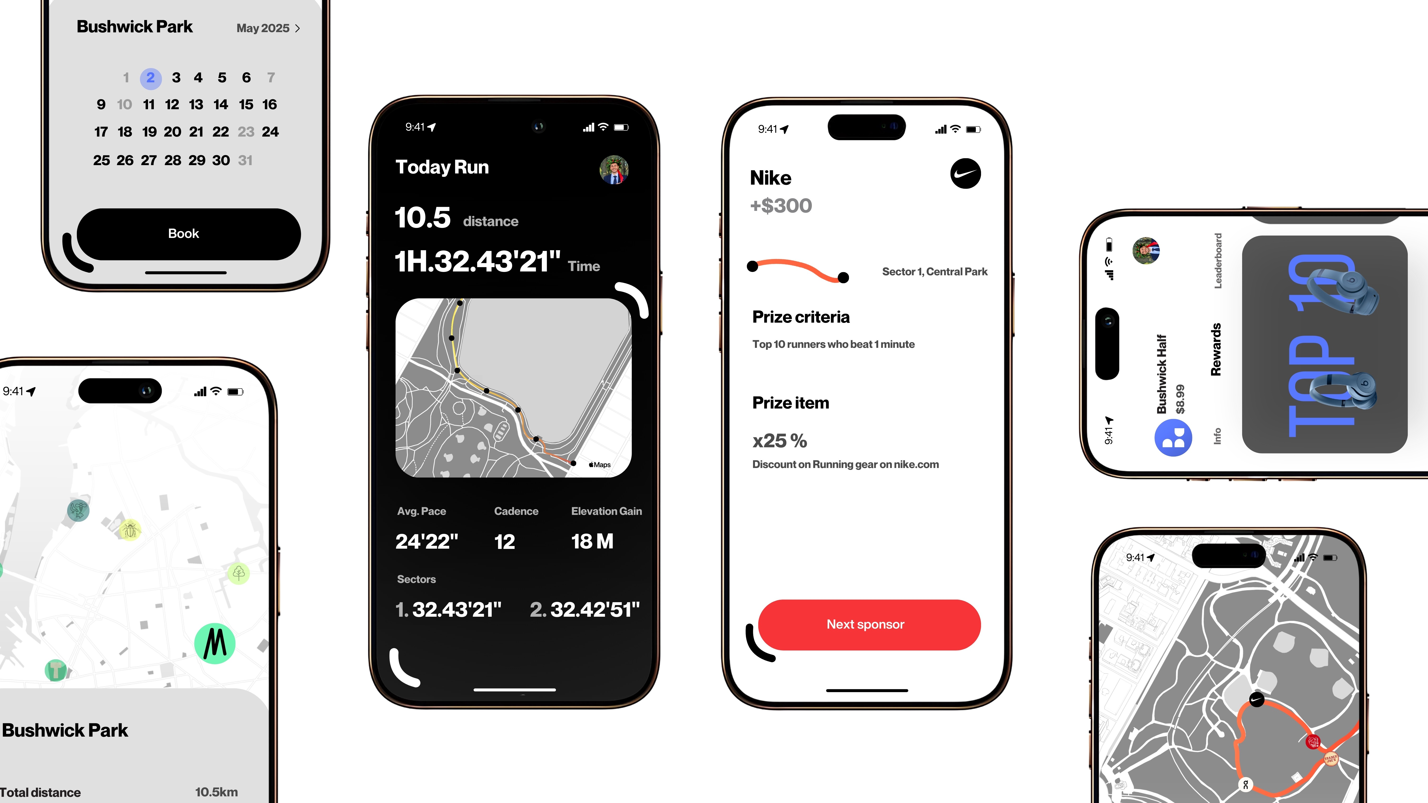
Building MOMO’s digital platform came with unique challenges from integrating real-time race data to ensuring seamless mobile performance. Our team tackled complex UX flows, custom animations, and scalable backend logic to deliver a product that feels effortless to use. Despite the technical demands, the result is a fast, intuitive, and responsive experience across all devices built to support both runners and organizers with reliability and clarity.

The concept behind MOMO blends digital innovation with physical product design. Our vision was to create a unified identity that connects the brand’s virtual features with its physical components. Leveraging advanced AI tools and deep expertise in prompt engineering we developed high-quality visual concepts for MOMO’s two core hardware elements: the SmartPod and the checkpoint. These assets proved instrumental in aligning design with production, accelerating decision-making during prototyping. The outcome is a sharp, functional, and scalable visual language that bridges technology, sport, and real-world usability.